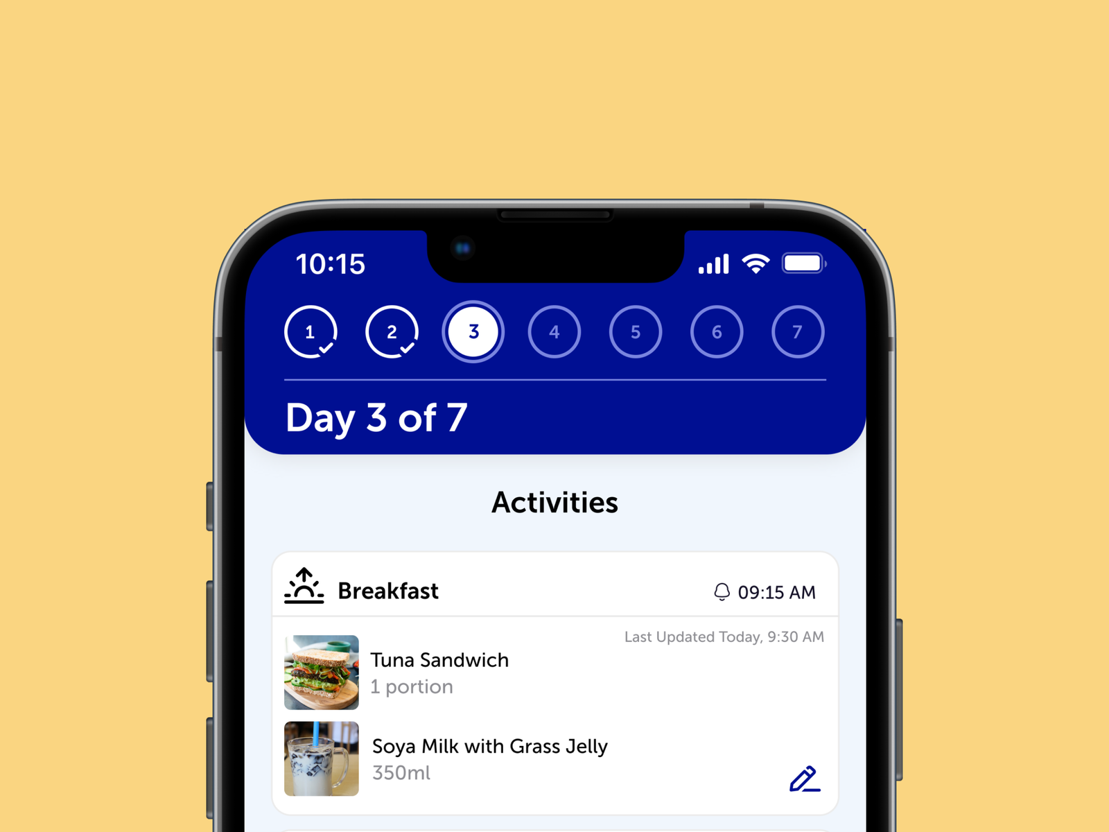
In the summer of 2021, I joined Originally Us as a UI/UX Design Intern. The main project I worked on was doing end-to-end design for a weight management app for a government hospital. Here are my takeaways from this project.
FoodLog is not the actual name of the app. The actual name and details of the work are censored to comply with NDA. I’d be happy to share the designs I created and chat more deeply about my experience over email (heyrachelkhan@gmail.com).
Collaborators:
UX Team, Developer Team, Project Manager and Product Owners
Project Duration:
3 months (May – July 2021)
Tools:
Figma, Pletica
What I did
- Requirements Gathering
- Stakeholder Interviews
- Site-mapping
- User Flows
- Low-fidelity Wireframes
- High-fidelity Mockups
- Usability Test plans
The Process
Gathering Project Requirements through Stakeholder Interviews
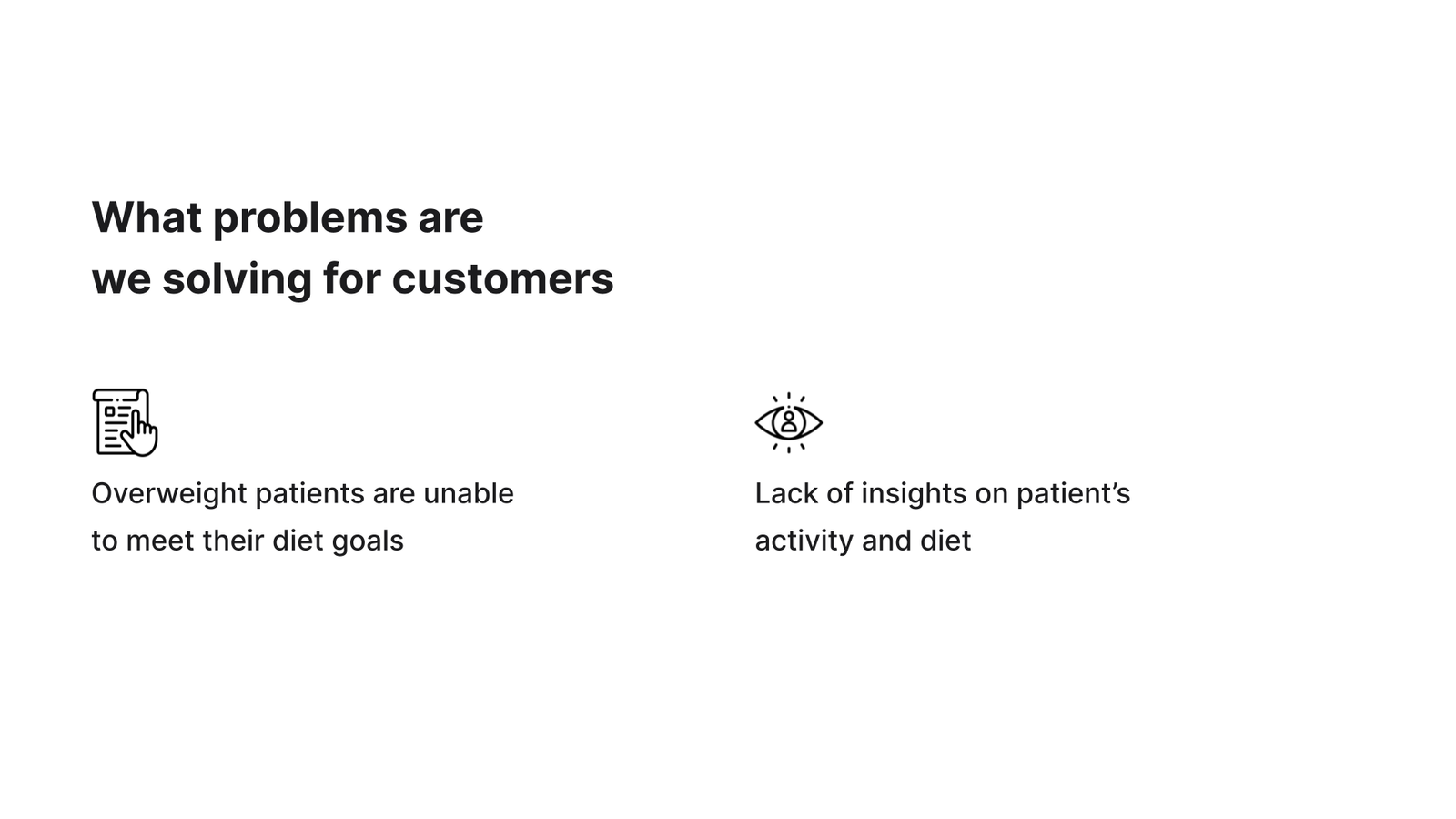
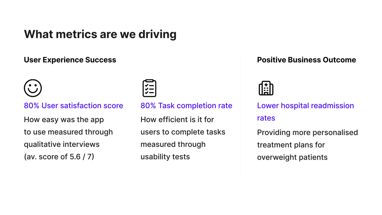
Conducting user and product studies, as well as deep discussions with the client at the start of the project allowed us to understand the context of the product and formulate plans to meet the app objectives. This allowed us to pinpoint what clients and users want so that we can create a useful app.
Creating Sitemaps to plan out Information Architecture
After scoping the project, I created sitemaps using Pletica. We would present sitemaps to stakeholders to confirm that the app is heading in the right direction. I also updated the sitemap to reflect any changes made to the app’s structure during the course of the project.
Designing Wireframes, then transforming them into Mockups
Once the sitemaps were ready, I worked with the UX design team to create low-fidelity wireframes. Then, we moved on to designing the high-fidelity mockups and making sure that the screens are pixel perfect for developer handoff.
I also had the opportunity to create Illustrations, Icons and Animations for key screens. All of the design work was done in Figma.
😀 We were able to handoff the designs to developers within project deadlines.
Writing Usability Test plans
I planned out a Remote Moderated Usability Test and recruited 5 participants. Here is an overview of the Usability Test plan created:
- Goals of Usability Test
- Participant Criteria
- Task Scenarios
- Formulating User Goal and Task
- Listing Expected Behaviours
- Usability Metrics for Effectiveness, Efficiency, and Satisfaction
- Detailed Script and Presentation Slides for actual Usability Test Session
I was unable to conduct the actual Usability Test before my internship ended as the beta version of the app was not fully complete.
Doing Quality Assurance of Beta version of the App
I analysed the beta app and listed out bugs in the app that affected the user interface and usability of the app. Any design inconsistencies between the actual app and the mockups were noted and passed on to the developers for revision.
Learnings from this project
- I felt slightly disappointed when certain designs could not be implemented due to business or technical constraints. But I learnt that it is natural for some designs to be rejected to create a product that works best for all stakeholders and our users.
- It is important to communicate clearly the intentions behind my designs to the rest of the team to show why it would be useful for the product.
- Technical feasibility of designs should be discussed with developers to consider the effort required for them to implement the designs.
- Creating pixel perfect designs for developer handoff is crucial to ensure that the layout remains consistent throughout all screens.
- Although technical skills are necessary for UX designers, the thought process is actually more important when designing a solution. UX design is about formulating interactions and features that add value to the end user and creates a more user friendly experience for them.
