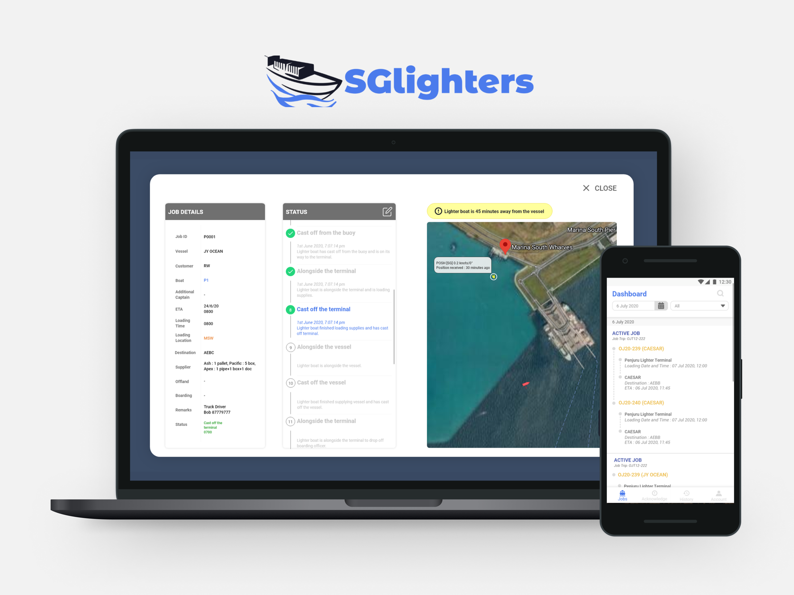
In the summer of 2020, I joined Ship Supplies Direct as a UI/UX Design Intern. The main project I worked on was to create SGLighters, a digital platform consisting of a website and a mobile app aimed at making lighter boat deliveries easier for stakeholders.
What is a Lighter Boat? It is a type of boat used for transporting goods and passengers to and from anchored ships at sea.
Collaborators:
CTO and Software Engineer
Project Duration:
8 weeks (June – July 2020)
Tools:
Adobe XD, Illustrator, Draw.io
What I did
Being the sole designer, I worked on:
- gathering project requirements through zoom interviews with user
- conduct user research and analyzing existing solutions
- building the UX architecture
- prototyping a website and a mobile app in Adobe XD
- designing the logo
- testing final mockups with stakeholders
The Problem
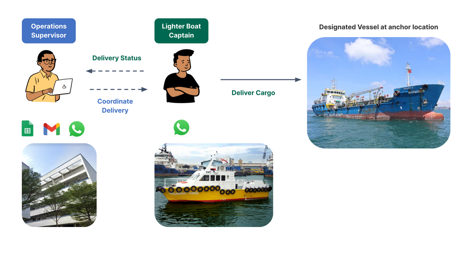
Lighter companies currently use multiple spreadsheets and telecommunication channels to coordinate their lighter deliveries. Their current manual coordination creates large time wastage.
The Solution
My goal was to create a lighter delivery management platform to help stakeholders in the lighter delivery process manage and track deliveries more efficiently. The platform consists of:
- Website for lighter operators
- Mobile application for both lighter operators and boat captains
The Design Thinking Process
🗣 Step 1: Research
- Empathise with users to pinpoint the user’s needs
📝 Step 2: Ideate
- Create potential solutions using user flows
🛠️ Step 3: Prototype
- Reiterate mockups based on user feedback
💬 Step 4: Concept Testing
- Walking through final designs with stakeholders
Step 1: Research
Stakeholder Interviews
Together with CTO, I conducted Zoom interviews with a Lighter Operator to gather requirements and understand the pain points of lighter operators and boat captains.
Key takeaways from stakeholder interview:
1. Pain Points

Operator (Admin)
- Difficult to track location and status of lighter during delivery
- Struggle to manually optimize usage of lighter fleet
- Tedious to continuously check vessel estimated time of arrival

Boat Captain (Delivery Man)
- Inconvenient to manually give updates of timestamps during lighter delivery
2. They discarded their previous mobile app after using it for a year 😮
The lighter boat company had previously engaged an external vendor to create a mobile app for them to manage their lighter deliveries. However, they stopped using the app after a year due to the poor user experience. I did an app analysis of the previous app and interviewed the lighter operator to understand what went wrong with their app.
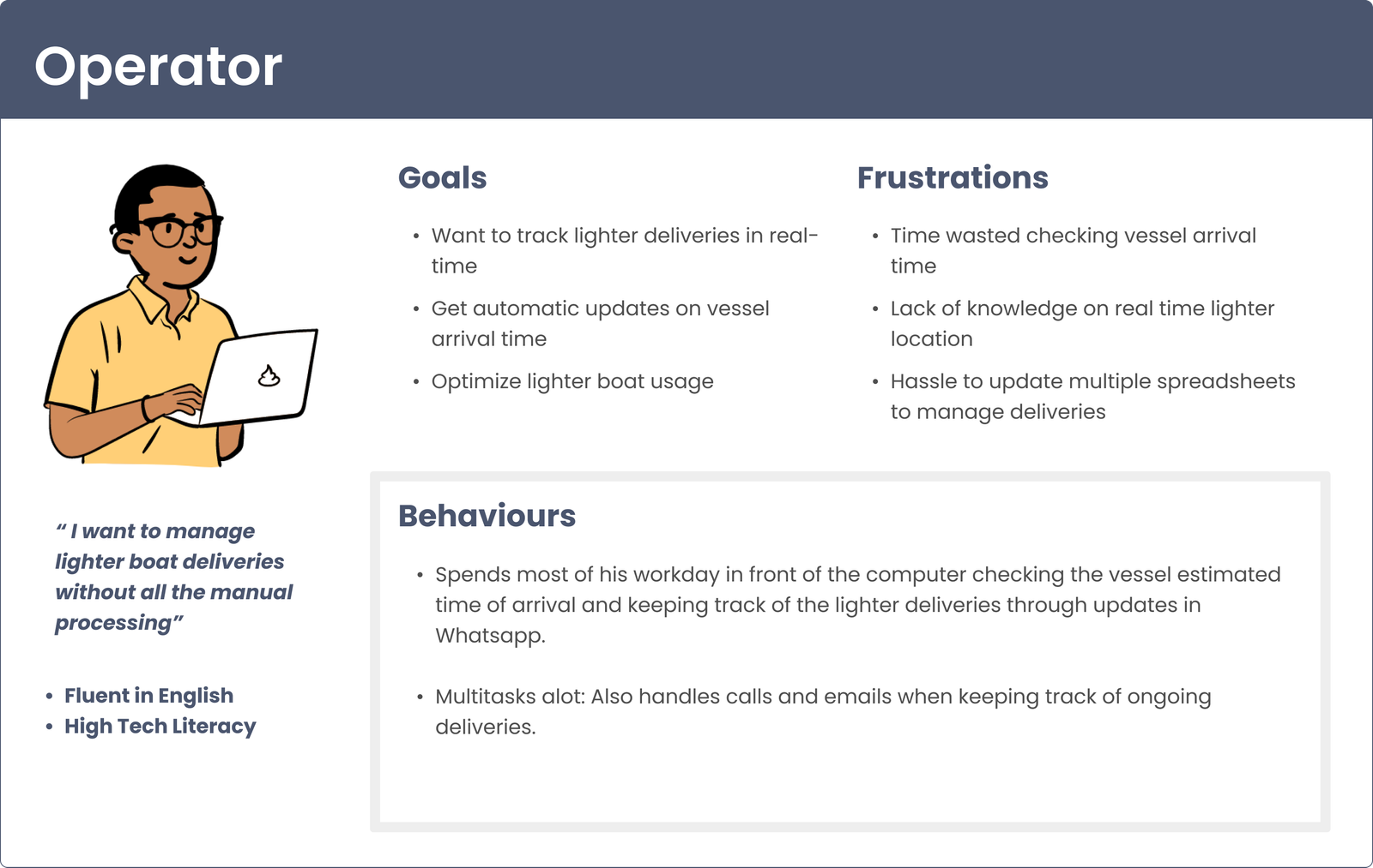
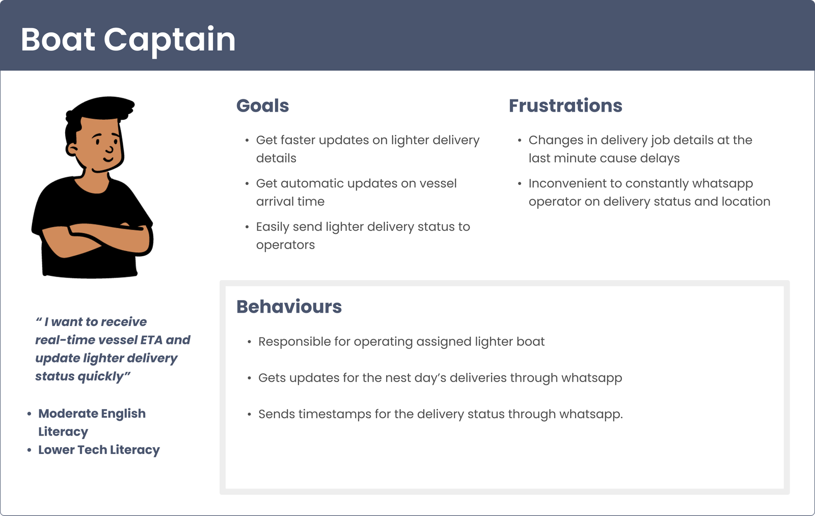
Creating User Personas
For the team to build empathy and provide direction for making design decisions
Step 2: Ideate
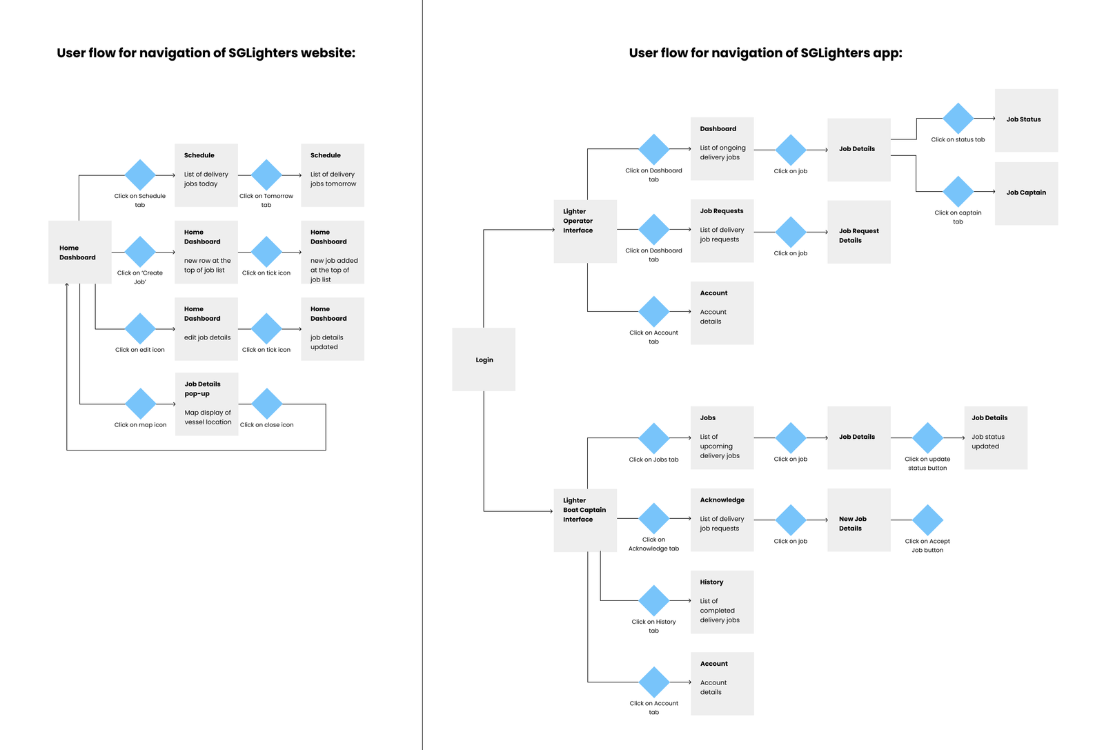
User Flows
I created user flows to show how the 2 parties can use the website and mobile app for a lighter delivery. This step allows me to collaborate with the developers to determine the feasibility of the design.
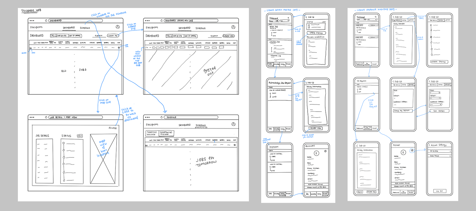
Wireframes
I sketched low-fidelity wireframes to show the developers how the user will navigate through the website and the app.
Step 3: Prototypes

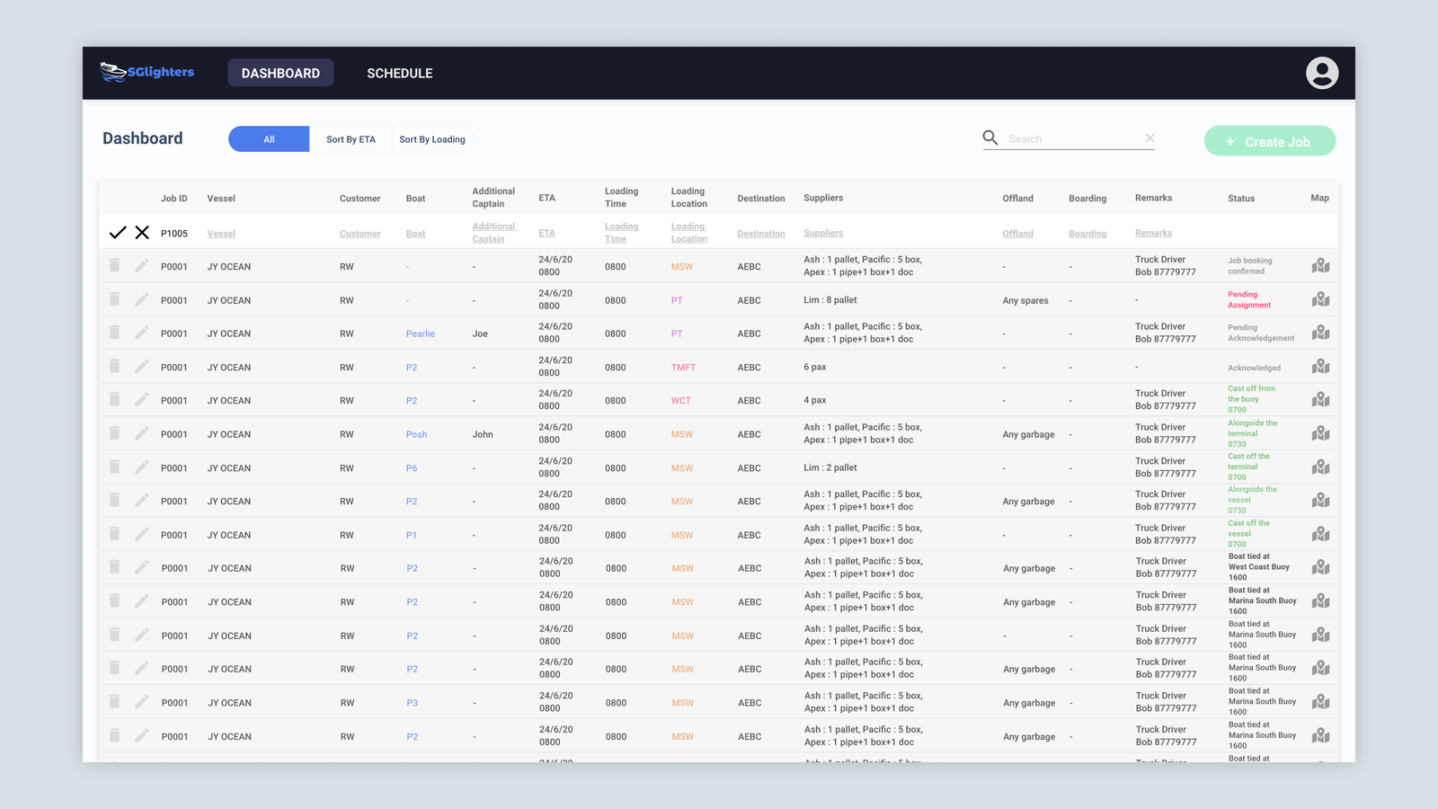
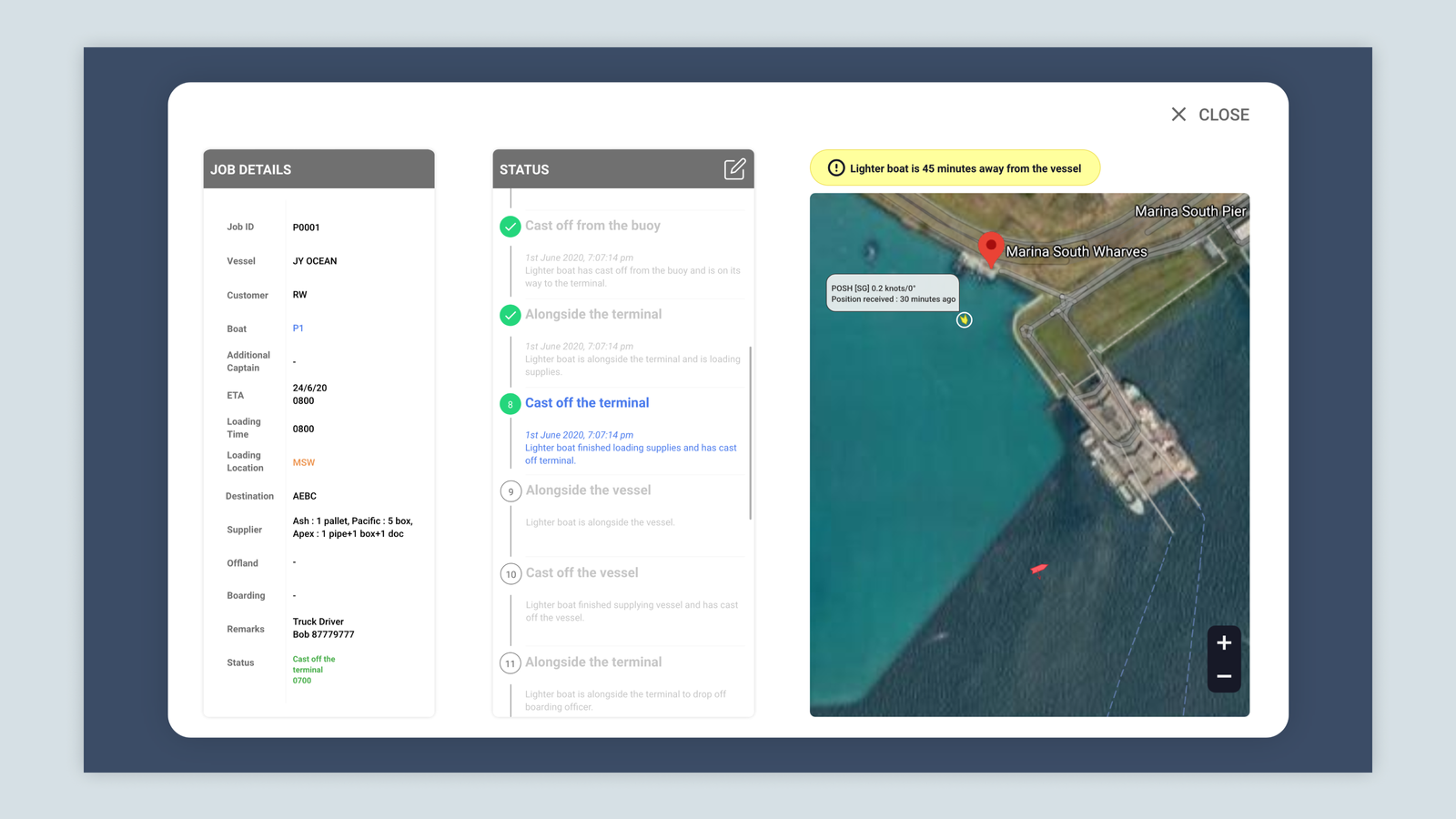
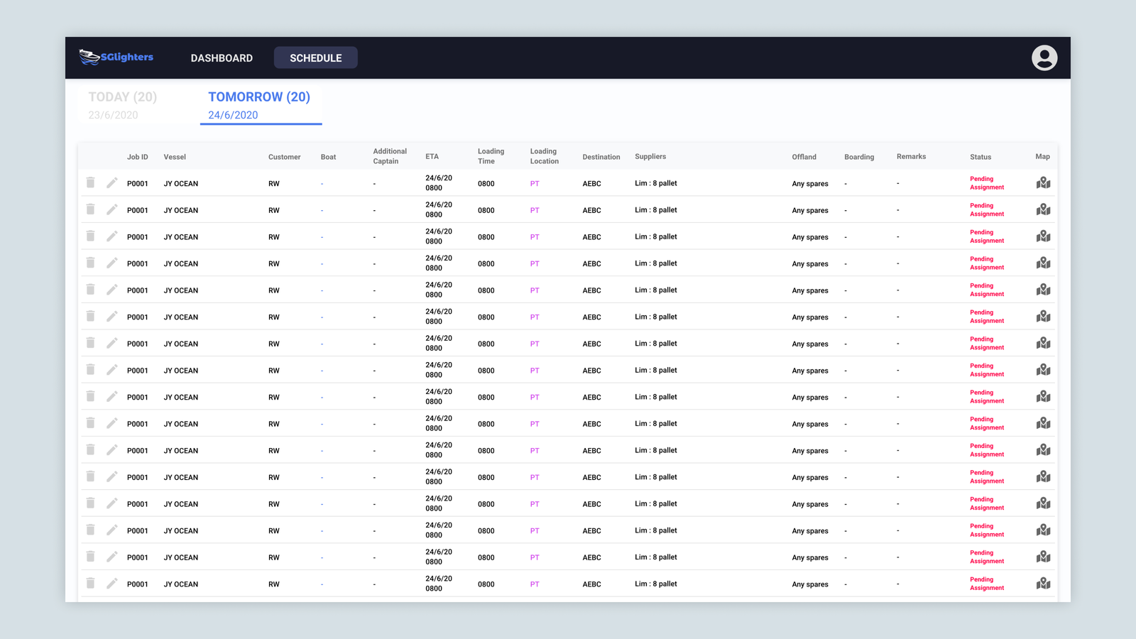
SGLighters Website: For Operator
Dashboard with automatic updates for operators to speed up delivery coordination

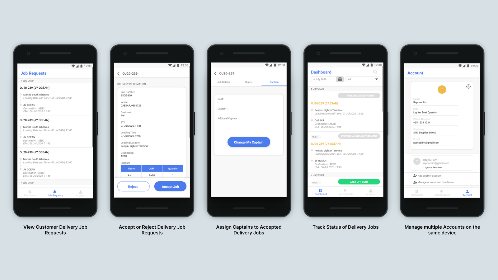
SGLighters App: For Operator
Reduce delivery coordination time for operators when they are out of office

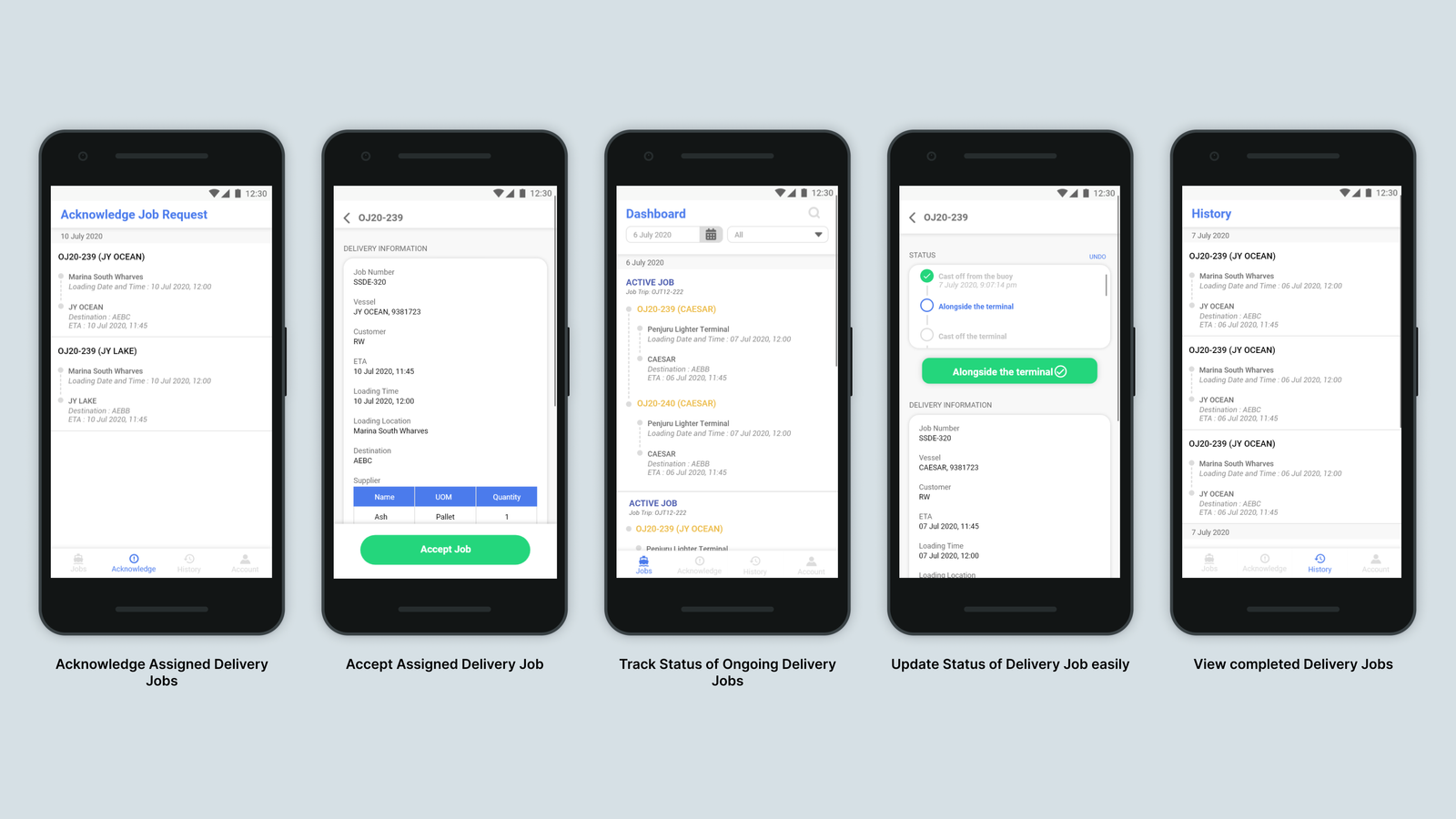
SGLighters App: For Boat Captain
Simple and fast way for boat captains to send timestamps for lighter deliveries while out at sea
Step 4: Concept Testing
Due to the COVID-19, I was unable to do in-person usability testing with the prototypes.
Instead, I did zoom video meetings with the lighter operator where I utilized interactive mockups to demonstrate the usage of the website and app and gathered their feedback on them.

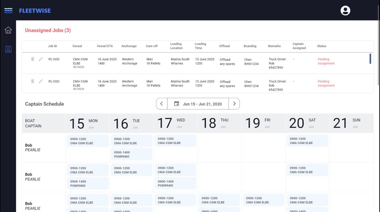
Key Takeaway: Operator found Calendar view complicated
Initially, I designed a calendar format to allow lighter operators to manage their lighter deliveries.
During concept testing, the lighter operator said that this seemed complicated to use and preferred something similar to Google Sheets (which they were currently using).

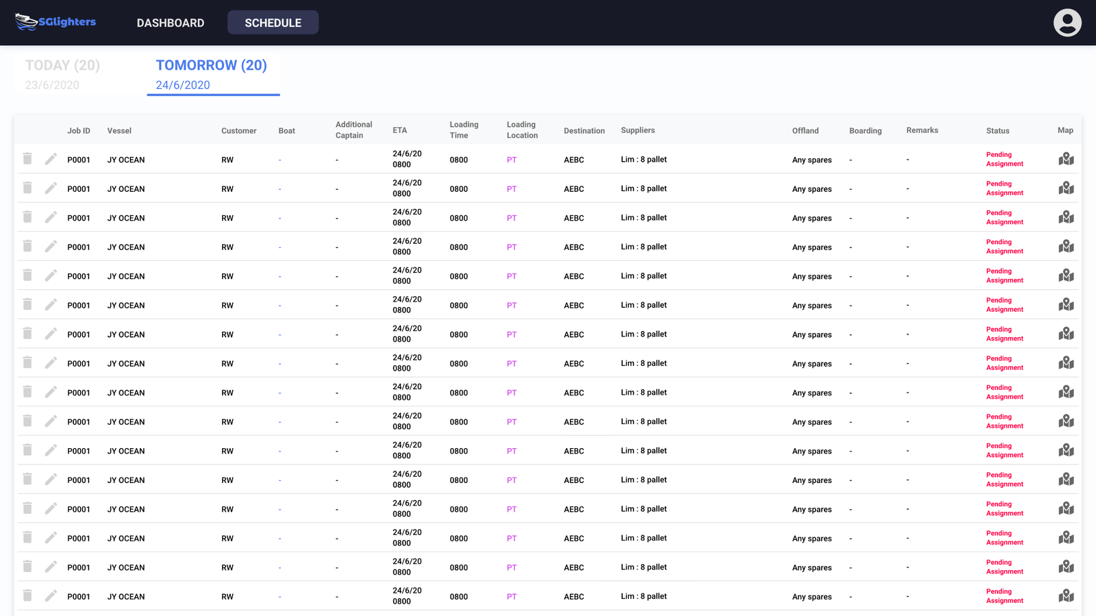
Iteration: Changed to Table view
Based on user feedback, I changed the website interface to make it similar to Google Sheets. This is to reduce the learning curve faced by lighter operators when switching to this website to coordinate their lighter deliveries.
Metrics
In the future, to gather more quantitative and qualitative metrics, further testing should be conducted to design a platform that functions at scale. A post-launch analysis could be conducted to measure how the new sea delivery platform impacts business outcomes.
Measuring User Experience Success
- User satisfaction score
- How pleasing was the website and app to use measured through moderated user testing
- Task Completion Rate
- How efficient it is for users to complete tasks measured through moderated user testing
Measuring Positive Business Outcome
- Increase in profits
- How many more lighter deliveries are completed after the platform is launched
Reflections
- If I had more time, I would have conducted an online moderated usability test (Zoom) with both lighter operators and boat captains to get their feedback on the mockups. I would send them the link for the clickable prototype on Adobe XD and have them complete task scenarios to measure the: Time on task, Task Completion Rate and Ease of Use.
- I was unable to do this due to time constraints and my company had a practice of doing user testing with the working prototype.
- This was my first time working as a UI/UX Designer and I had the opportunity to interact with the end user and learn how to conduct user interviews. It was an amazing learning experience and it solidified my decision to pursue UI/UX as a future career.
Recommendations 👍
“Rachel worked in our Product Team as a UI/UX intern during her university summer break in 2020. Despite the challenging working circumstance, as Singapore was in the midst of the COVID19 pandemic lockdown, Rachel always had a very positive and proactive attitude to her work, asking good questions, coming up with great product designs for our upcoming product developments. When gathering user feedback, she was thorough and structured in her questioning, assisting us in accelerating the product designing process. She was able to grasp the concepts shared about our industry, which can be very complicated due to the traditional nature of our industry, and craft designs that were easy to use. I am certain that Rachel would be able to value add to any team that she joins.”
Mr Eric Chean Yuefei , CEO of Ship Supplies Direct
“Rachel is highly attentive to details in her design work, and would pay special attention to the necessary elements which make the user experience smoothing. Being thoughtful and responsible in her daily work, she demonstrated great ownership over the applications she worked on.”
Mr Chew Chin Rui , CTO of Ship Supplies Direct
